

Overview
Dashboard Visualizations present analytical information using graphical and tabular representations, allowing users to analyse transaction activity from different perspectives.
The visualizations reflect the currently selected merchant, Dashboard filters, Dashboard search criteria, analytical data category, and the authenticated user’s permissions.
Different visualization modes present the same analytical information using different graphical formats, enabling users to monitor transaction trends and compare transaction data more effectively.
Available Visualization Types
The Dashboard displays the information of the selected analytical category using graphical representations.
Depending on the selected Dashboard configuration, transaction information can be displayed as:
- Bar graphs
- Line graphs
- Lists
Each graphical representation displays the same analytical information using a different presentation format.
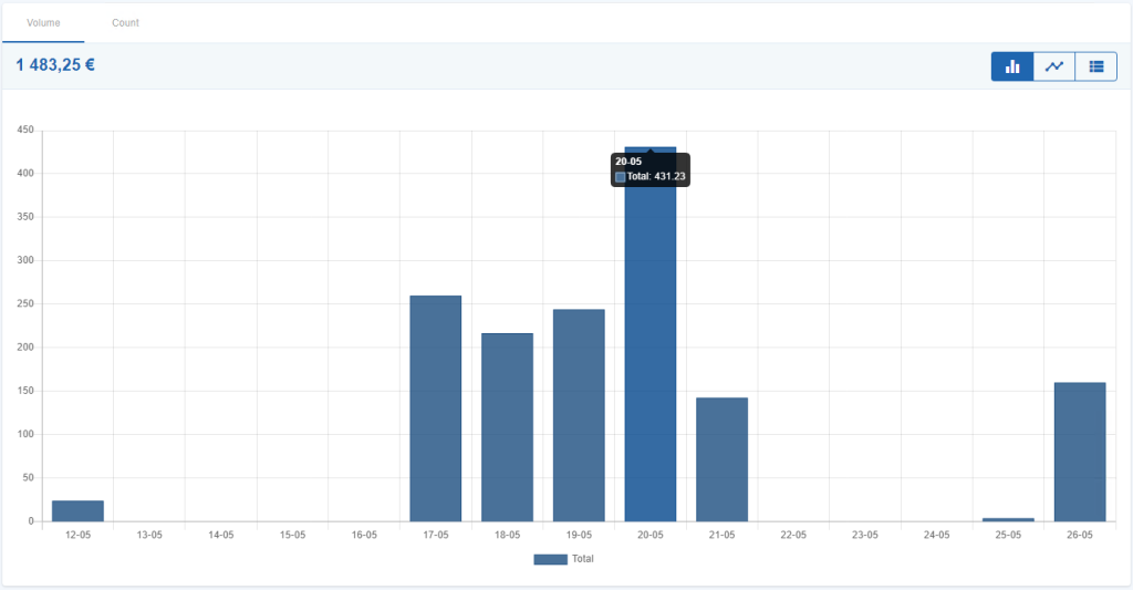
Figure 1 – Example of graph per Method
Selecting the Transaction Unit of Measure
Dashboard graphs can display transaction information using two different analytical measurements:
- Volume, representing the total monetary value of completed transactions.
- Count, representing the total number of completed transactions.
Changing the selected unit of measure automatically updates the displayed graphs while maintaining the selected Dashboard filters, search criteria, and analytical category.
Volume
When the Volume option is selected, the graph displays:
- Transaction volume on the vertical axis.
- Time (hours or days) on the horizontal axis.
To calculate the displayed transaction volume:
- Completed MULTIBANCO Reference Payment transactions are included.
- Completed Purchase transactions are included.
- Completed Refund transactions are deducted from the total amount for the corresponding period.
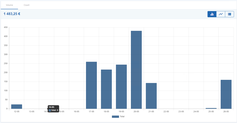
Figure 2 – “Volume” unit of measure
Count
When the Count option is selected, the graph displays the total number of completed transactions on the vertical axis.
All completed transaction types are included when calculating the displayed transaction count.
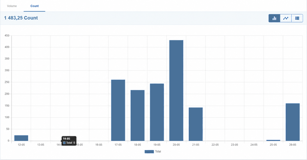
Figure 3 – “Count” unit of measure
Selecting the Graph Type
The Dashboard allows users to change the graphical representation used to display analytical information.
The available graph types are:
- Bar Graph
- Line Graph
- List
Changing the graph type does not modify the displayed transaction information. Only the graphical representation changes.
Bar Graph
The Bar Graph representation displays analytical information using coloured segmented bars representing the values of the selected analytical category.
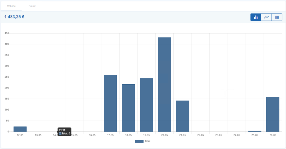
Figure 4 – “Bar Graph” representation
Line Graph
The Line Graph representation displays transaction evolution over time using connected data points.
This representation is particularly useful for analysing transaction trends during the selected period.
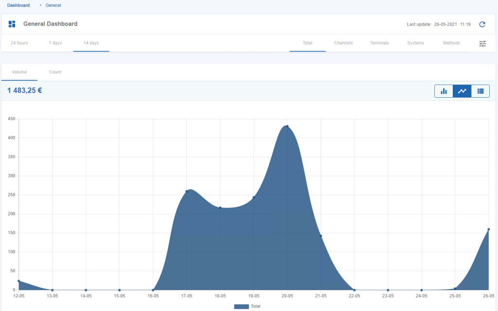
Figure 5 – “Line Graph” representation
List
The List representation displays the analytical information using a tabular format.
This view complements the graphical representations by presenting the same analytical information in a structured list.
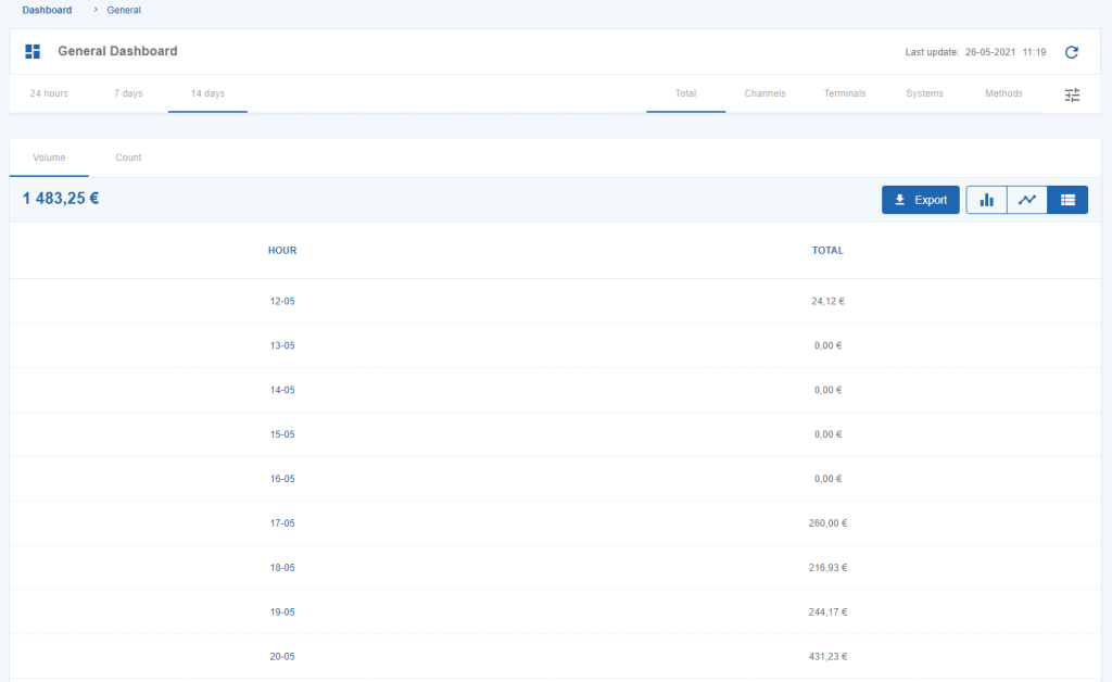
Figure 6 – “List” representation